You already know the situation. You paid for a website redesign, the branding looks polished, the photos are sharp, and people compliment it. But the phone isn't ringing enough, form fills are inconsistent, and your site feels more like a portfolio piece than a sales asset.
That gap is where most businesses lose money.
Website design lead generation isn't a matter of adding a prettier homepage, a few buttons, and a contact form. A site that produces leads consistently is a system. It combines buyer psychology, page structure, technical performance, search visibility, and automation so each visitor gets nudged toward the next action instead of wandering off.
Business owners across Central Florida run into the same problem. They hire for looks, not outcomes. Then they wonder why traffic doesn't turn into calls, appointments, and deals.
Table of Contents
- Your Website Looks Great But Is It Making You Money
- The Strategic Foundation Before a Single Pixel Is Placed
- Designing for Decisions Not Just Impressions
- The Anatomy of Irresistible CTAs and Forms
- Building a Technical Core for Speed and Visibility
- Connecting Your Site to a Full Growth System
- From Digital Brochure to 24/7 Sales Engine
Your Website Looks Great But Is It Making You Money
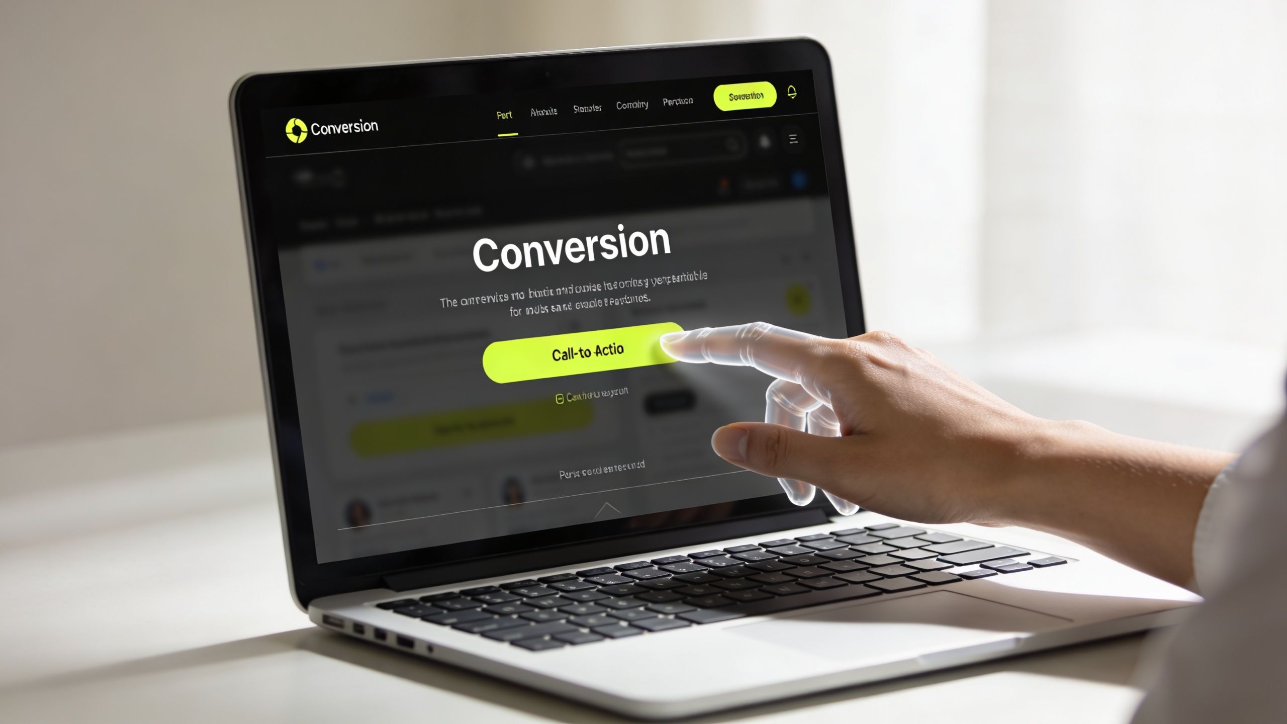
A business owner approves a redesign, signs off on the photos, likes the colors, and finally feels proud to send people to the site. Then the true test starts. Traffic lands, people scroll, and almost nobody calls, books, or fills out a form. The site looks polished. Revenue stays flat.
The result is a website that functions like a brochure. It shows the business. It does not help the buyer make a decision.
That distinction matters more than most owners realize. A good-looking site can still fail if it does not reduce doubt, guide attention, and make the next step obvious. Real website design for lead generation is a system. Strategy, psychology, technical performance, and automation have to work together. If one piece is weak, the site leaks opportunities all day.
Your site should do more than represent your brand. It should create demand, capture intent, and push qualified prospects into your sales process.
Take a home services company in Orlando. The homeowner landing on that homepage is not admiring the layout. They are stressed and trying to answer four fast questions. Can you fix this? Can I trust you? How quickly can I reach someone? What should I do right now?
A site that converts answers those questions in seconds. A site that underperforms buries them under vague headlines, stock phrases, and generic design trends.
That is the standard to use. Do not judge your website by how modern it looks in a meeting. Judge it by whether it consistently books calls, captures leads, and supports the rest of your growth system.
If your current site feels polished but passive, start with these practical ways of improving website conversion rates.
The Strategic Foundation Before a Single Pixel Is Placed
Most businesses start too late in the process. They open Figma, browse themes, debate colors, and talk about making the site feel modern. That's backwards. If the strategy is weak, the design just hides the problem better.

Start with the buyer not the brand
Before anything gets designed, answer three blunt questions:
- Who are you trying to convert: Not “everyone who needs our service.” Name the buyer. A property manager. A general counsel. A parent searching for pediatric care. A homeowner with an emergency plumbing issue.
- What problem are they trying to solve right now: Not your full service menu. Their immediate pain. They want a quote, clarity, speed, reassurance, proof, or availability.
- Why should they choose you instead of the next option in search results: Faster response, clearer process, stronger proof, better specialization, more convenient scheduling, stronger trust signals.
If you can't answer those in plain English, the website will drift into generic messaging. Generic messaging kills leads because buyers don't know whether the site is meant for them.
Practical rule: If your headline could fit ten competitors, it's too vague.
Map the path before you design the page
A high-converting site follows a defined path. It doesn't dump every service, every idea, and every menu item on one screen.
A simple journey usually looks like this:
| Stage | What the visitor needs | What the page must do |
|---|---|---|
| Awareness | Relevance | Confirm you solve their problem |
| Consideration | Confidence | Prove credibility and remove doubt |
| Decision | Clarity | Present one strong next step |
| Follow-up | Momentum | Route the lead into sales fast |
That structure changes everything. It tells you what belongs above the fold, what proof should appear near the CTA, and where friction needs to be removed.
A law firm in Charlotte should not greet a cold visitor with dense language about legal philosophy. A smarter approach is direct: the case type, the urgency, the process, and the consultation path. A clinic should prioritize reassurance and ease. An e-commerce brand should prioritize product confidence and checkout flow. Different businesses need different buyer journeys, but every effective site is intentional.
That's why strategy has to come first. The page design only works when it's carrying a business argument, not just a visual style.
Designing for Decisions Not Just Impressions
Effective design avoids shouting and focuses on direction. Successful websites guide a visitor from uncertainty toward action by ensuring the next step feels clear and secure.
Guide the eye to the next action
When someone lands on your site, their attention has to be managed. If every block is competing for attention, nothing wins. Strong conversion design uses visual hierarchy to control what gets seen first, second, and third.
That means:
- One dominant action: Every key page needs one primary CTA.
- Clear contrast: Buttons, headlines, and key proof points must stand out from surrounding content.
- Breathing room: White space helps important elements get noticed. Crowding kills focus.
- Fast scanning: Most users skim before they read. Your page should still make sense at a glance.
A Florida HVAC company is a perfect example. A homeowner with no air conditioning doesn't want to admire subtle design flourishes. They want immediate answers. Emergency availability. Service area. Financing or quote options. Social proof. A big “Schedule Service” button. The layout should respect urgency.
If you want a deeper look at page structure that turns traffic into action, study this breakdown of landing page design for higher conversion rates.
Trust has to show up before the ask
A lot of websites ask too early. They push “Contact Us” before the visitor has any reason to trust them.
Trust signals should sit close to decision points:
- Testimonials: Near offers and forms, not buried on a separate page
- Client logos or partner badges: Useful when recognition matters
- Process clarity: Buyers trust what they understand
- Photos that feel real: Relevant visuals beat generic stock art
- Security and compliance cues: Especially important for healthcare, legal, finance, and e-commerce
This matters outside lead generation too. Teams working on optimizing affiliate program conversions focus on the same principle. Friction drops when trust, relevance, and next-step clarity appear in the right order.
The page should answer objections before the user forms them. Do you serve my area. Do you handle my type of problem. What happens after I submit. How long will it take. Are you legitimate.
A convincing site doesn't rely on clever wording. It removes uncertainty.
Here's a short visual example worth watching:
Good conversion design is built not guessed
Design taste is subjective. Conversion behavior isn't.
You don't need a homepage that everyone in your office likes. You need one that helps the right visitor act. That's why strong teams review heatmaps, scroll depth, CTA clicks, form interaction, and session recordings. Then they refine.
If a visitor can't tell what to do in a few seconds, the design failed, even if it looks polished.
Experienced execution matters in this context. The difference between attractive and effective usually comes down to disciplined decisions about hierarchy, messaging, trust, and flow.
The Anatomy of Irresistible CTAs and Forms
Most websites lose leads at the moment they ask for action. The CTA is weak, the form is too long, or the offer is so generic that visitors don't see a reason to respond.
That's not a traffic problem. That's a conversion problem.
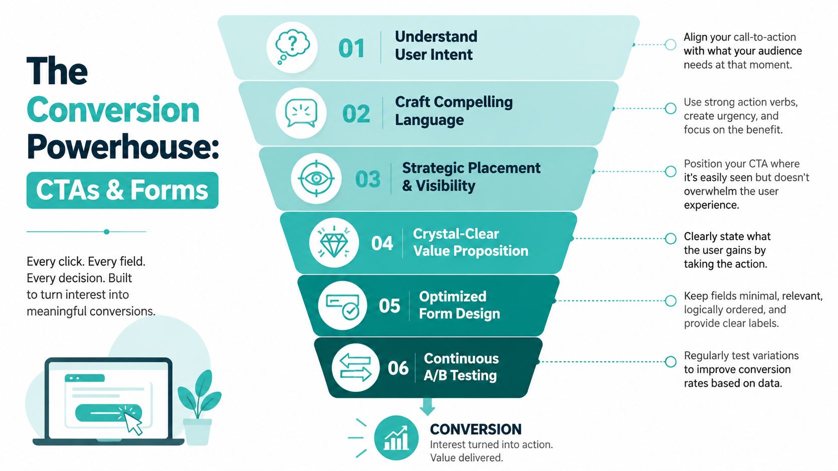
Most CTAs fail because they ask too little or too much
“Submit” is lazy. “Learn More” is usually too soft. Good CTAs tell the user what they get and why it's worth clicking.
Better examples:
- For service businesses: Get a Free Quote, Book a Consultation, Schedule Service
- For legal or healthcare: Request a Confidential Review, Speak With Our Team
- For e-commerce or productized services: See Pricing, Start Your Order, Get My Custom Plan
The wording should match buyer intent. Someone on a homepage may want a consultation. Someone on a service page may be ready for a quote. Someone on a pricing page may want to book now.
Strong CTAs lower hesitation because they make the reward obvious.
Placement matters too. Put your primary CTA above the fold, repeat it after key proof sections, and make it easy to find on mobile. If your user has to hunt for the button, you're leaking revenue.
If your current lead flow is messy, this guide on building an efficient lead capture system is the right next read.
Why multi-step forms outperform the long form dump
Long forms create resistance. Visitors see a wall of fields and bail.
A smarter structure is a multi-step funnel. Businesses can reduce abandonment by 35% by using a multi-step funnel instead of a single long form, and this approach also boosts lead quality and submission rates by 25% to 40%, based on Emergent's lead generation website guidance.
That works because the form asks in stages. Contact details first. Qualification questions second. Scheduling or routing last. The visitor feels progress instead of pressure.
Here's what that looks like in practice:
- Step one: Name and email or phone
- Step two: Service type, project category, urgency, or location
- Step three: Preferred appointment time or booking handoff
That format is useful for law firms screening case types, contractors filtering project scope, and clinics routing by service line. You get cleaner data without overwhelming the user upfront.
What to test before you buy more traffic
Before spending more on PPC or SEO, test the bottlenecks already on the page.
A/B tests should focus on things that change user behavior:
- Headline angle: Problem-first versus result-first
- CTA copy: “Get My Quote” versus “Book Consultation”
- Form depth: Short first step versus full form
- Proof placement: Testimonials near the form versus lower on page
- Visual emphasis: Prominent CTA contrast versus subdued styling
The point is simple. Don't buy more clicks into a broken conversion path. Fix the ask first.
Building a Technical Core for Speed and Visibility
A prospect taps your ad, lands on your site, waits three seconds, and leaves before the headline finishes loading. That loss has nothing to do with your logo, your color palette, or how polished the mockup looked in review. It happens because lead generation websites win or lose on the system underneath the design.

Mobile-first is not optional
Your buyers start on a phone. They search, compare, call, and fill out forms there. If the site is hard to use on a small screen, your conversion rate drops before your sales team gets a chance.
Mobile-first design means building the decision path for a thumb and a short attention span. Start with the smallest screen and force every element to justify its place. That usually leads to better desktop pages too, because the clutter gets cut early instead of patched later.
Focus on the parts that directly affect action:
- Buttons large enough to tap without misclicks
- Compressed images that load fast on cellular data
- Text that reads cleanly without zooming
- Forms with the right keyboard types and minimal friction
- Tap-to-call and tap-to-map actions for local businesses
For contractors and local service companies, usability and discoverability work together. A fast mobile site helps the visit. Local search setup gets the visit in the first place. If you serve a geographic area, this guide on optimizing visibility with GrowTradie is a useful reference for how service businesses show up in nearby searches.
Technical SEO is the engine under the hood
Business owners usually judge the homepage. Search engines judge the structure, speed, and clarity across the whole site.
Many website projects often fail due to specific design and development choices. The team obsesses over visuals, then piles on heavy scripts, oversized media, sloppy heading structure, weak internal linking, and thin location pages. The result is predictable. The site looks expensive, loads slowly, gets indexed poorly, and converts less traffic than it should.
A technical core built for lead generation includes three things working together. Performance keeps visitors from bouncing. Structure helps search engines understand what each page should rank for. Automation-ready architecture makes the site easier to track, test, and improve later.
| Area | What matters | Why it affects leads |
|---|---|---|
| Speed | Lean assets, caching, script control | Faster pages hold attention and reduce drop-off |
| Structure | Clear headings, internal links, clean page hierarchy | Helps users and search engines understand the page |
| Schema | Structured data for services, locations, reviews, organization | Improves how pages appear in search |
| Security | HTTPS, stable hosting, reliable updates | Builds trust and protects form activity |
| Accessibility | Usable navigation, labels, contrast, keyboard support | Removes friction for real users |
Start with speed if the site feels sluggish. Few fixes improve SEO, paid traffic performance, and conversion rates at the same time. This practical guide to website speed optimization covers the changes that usually produce the fastest gains.
A high-converting website is not a collection of design features. It is a coordinated system. User psychology gets the click. Technical performance keeps the visitor engaged. Search visibility brings in qualified demand. AI-driven automation makes the whole machine faster and more responsive. If one piece breaks, the rest work harder for worse results.
Connecting Your Site to a Full Growth System
A website on its own is not a growth strategy. It's one part of the system. If it doesn't connect to your CRM, ads, reporting, follow-up, and sales process, you're still operating with gaps.
Many businesses stall at this stage. They build the site, launch it, and treat the project as finished. It isn't finished. A lead generation website starts paying off when it's wired into the rest of the business.
Your website should talk to your CRM and ad platforms
Every important action on the site should be trackable and actionable.
That includes:
- Form submissions
- Phone clicks
- Appointment bookings
- Primary CTA clicks
- Landing page conversions
- Key scroll and engagement events
Those actions should flow into systems your team already uses, such as HubSpot, Salesforce, GoHighLevel, or another CRM. If a prospect fills out a form and the follow-up sits in an inbox for hours, the website did its job and the business still lost the lead.
A better setup routes leads immediately. The right pipeline gets tagged. The right team member gets notified. The right email or SMS sequence starts. That's not a luxury feature. It's basic operational discipline.
For businesses serious about website design lead generation, a strong starting point is a proper lead generation funnel architecture instead of disconnected pages and one-size-fits-all forms.
AI belongs inside the lead flow
AI gets talked about loosely, usually as a trendy add-on. That's the wrong way to think about it. In a lead generation context, AI should help qualify, route, and personalize.
Businesses that integrate AI into lead generation see a 50% increase in sales-ready leads. In addition, 64% of businesses using AI chatbots report more qualified leads, with some seeing up to a 20% higher conversion rate in B2B settings, based on Martal's lead generation statistics.
Those numbers matter because they point to a practical shift. AI is useful when it reduces delay and improves relevance.
Here are three smart uses:
Real-time qualification
A chatbot can ask what service the visitor needs, where they're located, and how urgent the request is. That keeps basic screening off your staff and helps route better leads faster.Intent-based routing
Someone clicking from a PPC campaign about emergency plumbing should not see the same path as someone reading a blog post about maintenance. AI and automation can route each visitor to the right experience.Follow-up acceleration
If a lead abandons a form or starts a booking but doesn't finish, automated workflows can trigger reminders or alternate contact options.
The best use of AI is not novelty. It's speed, relevance, and cleaner qualification.
This is especially valuable for service businesses in competitive local markets. A legal office, clinic, contractor, or home services brand often loses deals because response time is slow and the intake process is clunky. AI helps close that gap.
Content PPC and landing pages need one shared system
Your homepage can't carry the whole marketing load.
A real growth system uses different pages for different traffic sources and buyer stages:
- SEO content pages answer specific search intent
- PPC landing pages match ad messaging tightly
- Service pages build credibility and move buyers toward inquiry
- Location pages support local relevance
- Retargeting pages reconnect with warm traffic
Strategy usually breaks down at this point. Businesses run ads to a generic homepage, publish blogs without internal conversion paths, or send every visitor to the same contact form. That creates mismatch. Buyers need continuity between what they clicked and what they see next.
A strong system fixes that by aligning message, page experience, and follow-up.
Consider a local med spa running Google Ads for a specific treatment. The ad should click through to a dedicated landing page for that treatment, not the homepage. The page should answer common objections, show proof, explain the process, and offer one next step. The form should route to the right coordinator. The CRM should trigger immediate follow-up. Analytics should show cost per lead by page and campaign. That's how you scale.
The same principle applies to e-commerce brands, just with different conversion events. Product pages, collection pages, quiz funnels, and abandoned cart flows all need to connect. Traffic without system design becomes expensive fast.
The website should make your sales process easier
The best lead generation websites don't just collect contacts. They pre-frame the sale.
That means the site should help your team by doing some of this work before a call ever happens:
- Explaining the offer clearly
- Setting expectations about timeline or process
- Filtering poor-fit leads
- Answering common objections
- Building trust before the conversation starts
When a prospect finally gets on the phone, they should already understand what you do and why you're credible. The website should not leave your sales team to rebuild confidence from scratch on every call.
That's the key point. A website isn't there to exist online. It's there to reduce friction, improve lead quality, and support revenue.
From Digital Brochure to 24/7 Sales Engine
A website that generates leads doesn't come from checking off random best practices. It comes from combining the right elements into one working system.
Strategy is essential before design. You need page structure that guides decisions. You need CTAs and forms that reduce friction. You need a technical foundation that supports speed, mobile usability, and search visibility. Then you need analytics, CRM integration, and automation so the leads move somewhere useful.
Most businesses can understand these parts. Very few execute all of them well at the same time.
That's why so many sites look fine and still underperform. The issue usually isn't effort. It's orchestration. Pieces are missing, disconnected, or built in the wrong order.
If your site isn't producing enough qualified leads, don't default to another cosmetic redesign. Diagnose the system. Look at the offer, the journey, the trust layer, the form flow, the mobile experience, the technical setup, and the follow-up. That's where the revenue gaps usually sit.
If you want a website that does more than sit online, talk with Emulous Media Inc. We help Central Florida businesses build high-performance websites that connect design, SEO, paid traffic, media, and AI automation into one revenue-focused system. Book a free consultation, call 689-255-6327, or visit the contact page to talk through your current site and where it's leaking leads.