
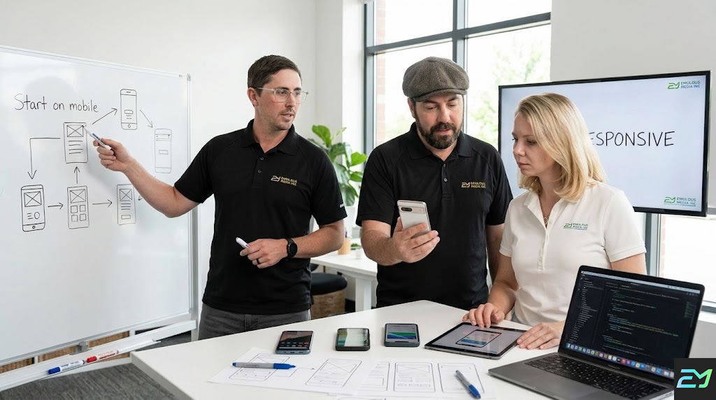
Mobile-First Responsive Design In Lake Mary
Stop losing customers to clunky mobile layouts. Start engaging them perfectly on every screen.
Website Design Services
- Custom Website Design
- E-commerce Development
- UI/UX Design Strategy
- High-Converting Landing Pages
- Website Maintenance & Care
- Mobile-First Responsive Design
- CMS Development
- Website Redesign & Modernization
- API Integration & Custom Functionality
- AI Chatbot Integration
- Voice Search Optimization (AEO)
- Consultation and Strategy
689-255-6327
Request a Consultation
Mobile-First Responsive Design in Lake Mary: Build Sites That Work On Every Device
Stop losing potential customers to frustrating pinch-and-zoom interfaces. We build fluid, responsive websites that automatically adapt to any device, providing a seamless user journey from mobile phones to desktop monitors.
Your website doesn’t appear on Google when potential customers search for your services. They find your competitors instead. You get zero traffic from search engines. You miss hundreds of qualified leads monthly because nobody knows you exist online.
SEO fixes this problem. Search engine optimization makes your website visible in Google search results for keywords your customers use. When someone in Lake Mary searches for your services, you appear on page one. They click. They visit your site. They become customers.
Most Lake Mary businesses rely entirely on paid advertising while competitors dominate organic search results. Paid ads disappear when you stop spending. SEO delivers free traffic month after month, year after year. Once you rank, customers find you without ongoing ad costs.
Emulous Media provides comprehensive SEO services that get Lake Mary businesses ranking on Google’s first page for keywords driving actual customers. Our local team knows Central Florida markets. We deliver measurable increases in organic traffic, leads, and revenue through strategic optimization.
Call 689-255-6327 now for a free SEO audit. We’ll analyze your website, identify ranking opportunities, and show you exactly how to dominate local search results in Lake Mary.
Keep your site running perfectly on every new device and screen size. We provide expert ongoing support to monitor mobile performance, fix responsive layout issues, and ensure your on-the-go customers never encounter a glitch.
Mobile devices dominate web traffic. Customers browse, shop, and research on phones first. Websites that don't work perfectly on mobile lose over half their potential customers before showing any content.
The business impact is measurable:
- 63% of all website traffic comes from mobile devices
- 57% of users won't recommend businesses with poorly designed mobile sites
- 73% of mobile users have encountered websites that load too slowly
- Mobile-friendly sites rank higher in Google search results
- 40% of users switch to competitors after bad mobile experience
- Mobile commerce accounts for 73% of total e-commerce sales
- 85% of adults think company mobile sites should be as good or better than desktop
Your Lake Mary competitors build mobile-first. Their sites work flawlessly on phones. Their bounce rates are lower. Their conversion rates are higher.
You compete for the same mobile-dominant customers. Your mobile experience needs to match or exceed theirs.
Mobile-first is a design philosophy and technical approach:
Starting With Mobile
Designing for smallest screens first:
- Planning layouts for 375px width screens
- Prioritizing essential content and features
- Designing touch-friendly interfaces
- Creating thumb-friendly navigation
- Optimizing for vertical scrolling
- Minimizing data and load times
- Testing on actual phones continuously
Mobile-first forces focus on what matters most because space is limited.
Responsive Scaling
Adapting to larger screens:
- Adding content and features for tablets
- Expanding layouts for laptops
- Utilizing screen space on desktops
- Maintaining usability across all sizes
- Creating breakpoints at key screen widths
- Testing on actual devices at each size
- Ensuring smooth transitions between sizes
Responsive design means one website works everywhere instead of separate mobile and desktop sites.
Touch-First Interactions
Designing for fingers not cursors:
- Buttons minimum 44x44 pixels for easy tapping
- Adequate spacing between clickable elements
- Swipe gestures for galleries and navigation
- Pull-to-refresh functionality
- Avoiding hover-dependent interactions
- Large form inputs for easy typing
- Accessible controls within thumb reach
Touch interfaces require different design than mouse-based interactions.
Performance Optimization
Loading fast on mobile networks:
- Optimized images for mobile screens
- Minimal code and resources
- Lazy loading below-the-fold content
- Compressed files and assets
- CDN delivery for faster global access
- Browser caching for repeat visits
- Target under 2 seconds load time
Mobile users on cellular networks need fast-loading sites more than desktop users on broadband.
Content Prioritization
Showing what matters first:
- Critical content above the fold
- Progressive disclosure of details
- Collapsible sections for optional content
- Simplified navigation structures
- Clear visual hierarchy
- Focused calls to action
- Minimal distractions
Limited screen space requires tough decisions about what appears prominently.
Flexible Typography
Readable text without zooming:
- Base font size 16px minimum
- Scalable fonts adapting to screen size
- Proper line height for readability
- Sufficient color contrast
- Short line lengths on mobile
- Larger headings creating hierarchy
Small text forces zooming destroying usability.
Mobile Navigation
Menus working on small screens:
- Hamburger menus saving space
- Full-screen navigation overlays
- Sticky headers staying accessible
- Bottom navigation for thumb access
- Breadcrumb navigation for context
- Search prominently placed
Desktop horizontal menus don't fit mobile screens.
Form Optimization
Making data entry easy on phones:
- Large input fields easy to tap
- Appropriate keyboard types (email, number, phone)
- Minimal required fields
- Autofill support
- Clear error messages
- Progress indicators for multi-step forms
- Mobile payment options
Forms are harder on mobile. Optimization prevents abandonment.
Every responsive design project follows mobile-focused methodology:
Step 1: Mobile Audience Analysis
We understand your mobile visitors:
- Reviewing mobile traffic percentages
- Analyzing mobile device types
- Understanding mobile user behaviors
- Identifying mobile-specific needs
- Reviewing mobile conversion data
- Analyzing mobile search patterns
- Assessing mobile competition
Data reveals how mobile visitors differ from desktop users.
Step 2: Mobile Content Strategy
We prioritize content for small screens:
- Identifying essential content
- Planning content hierarchy
- Organizing information architecture
- Creating mobile-first sitemaps
- Designing progressive disclosure
- Planning responsive content
- Simplifying complex information
Not everything fitting desktop screens belongs on mobile.
Step 3: Mobile Wireframing
We plan mobile layouts first:
- Creating 375px width wireframes
- Planning touch interactions
- Designing thumb-friendly zones
- Organizing vertical content flow
- Planning collapsible sections
- Designing mobile navigation
- Testing mobile user flows
Mobile wireframes establish foundation before expanding to larger screens.
Step 4: Responsive Breakpoint Planning
We plan how designs scale:
- Defining breakpoints (mobile, tablet, laptop, desktop)
- Planning layout changes at each size
- Designing responsive navigation
- Planning image scaling
- Organizing multi-column layouts
- Testing intermediate sizes
Strategic breakpoints ensure designs work at every screen size.
Step 5: Mobile-First Visual Design
We create mobile designs first:
- Designing for 375px screens
- Creating touch-friendly interfaces
- Designing readable typography
- Planning color and contrast
- Designing simplified graphics
- Creating mobile style guides
Mobile visual design establishes look and feel before desktop expansion.
Step 6: Responsive Development
We build flexible code:
- Writing mobile-first CSS
- Implementing flexible grids
- Creating responsive images
- Building touch interactions
- Optimizing performance
- Testing across devices
Proper code makes designs adapt flawlessly.
Step 7: Multi-Device Testing
We verify everything works:
- Testing on actual iPhones
- Testing on actual Android phones
- Testing on tablets
- Testing on various laptops
- Testing on large desktop screens
- Testing in both orientations
- Testing across browsers
Real device testing catches problems simulators miss.
Step 8: Performance Optimization
We ensure fast mobile loading:
- Optimizing images for mobile
- Minimizing code and resources
- Implementing lazy loading
- Configuring caching
- Testing mobile network speeds
- Optimizing Core Web Vitals
Fast mobile performance keeps visitors engaged.
Step 9: Continuous Mobile Optimization
We improve based on data:
- Analyzing mobile behavior
- Testing mobile conversions
- Optimizing mobile CTAs
- Improving mobile forms
- Testing mobile features
- Iterating based on feedback
Mobile optimization continues after launch.
Mobile-first responsive design requires modern tools:
Design Tools: Figma, Sketch, Adobe XD for creating responsive designs and prototypes.
Development: HTML5, CSS3 with Flexbox and Grid, modern JavaScript for responsive functionality.
Frameworks: Bootstrap, Tailwind CSS, or custom frameworks for responsive components.
Testing: BrowserStack, real device labs, responsive design testing tools.
Performance: Lighthouse, WebPageTest, GTmetrix for mobile speed testing.
Analytics: Google Analytics, Hotjar for mobile user behavior analysis.
We select technologies ensuring optimal mobile performance.
Lake Mary businesses benefit from local mobile-first designers:
- Understanding of local mobile usage patterns
- Face-to-face design collaboration and reviews
- Quick iteration and testing cycles
- Knowledge of Lake Mary market preferences
- Partnership approach for ongoing optimization
- Easy communication and meetings
Complex responsive projects benefit from close collaboration.
Stop frustrating mobile visitors with desktop-only design. Contact Emulous Media today at 689-255-6327 for professional mobile-first responsive design in Lake Mary.
Our mobile-first design experience covers multiple sectors:
Retail and E-Commerce: Online stores where 75%+ of traffic comes from mobile shoppers.
Restaurants and Hospitality: Food service businesses where customers look up menus and hours on phones.
Professional Services: Law firms, accountants, consultants whose clients research on mobile.
Healthcare: Medical practices where patients book appointments on phones.
Real Estate: Property searches happening primarily on mobile devices.
Home Services: HVAC, plumbing, electrical services customers call from phones while experiencing problems.
Automotive: Car shoppers researching vehicles and dealerships on mobile.
Each industry has specific mobile usage patterns. We adapt designs to your sector behaviors.
Standard mobile-first design timelines:
- Small business site: 4-6 weeks
- Professional service site: 6-8 weeks
- E-commerce site: 8-12 weeks
- Corporate website: 8-12 weeks
- Complex custom site: 12-16 weeks
- Responsive redesign: 6-10 weeks
Timeline includes mobile-first design, responsive development, testing, and launch.
The difference between amateur and professional responsive design:
True Mobile-First: Professional designs start mobile and scale up. Amateur designs adapt desktop layouts poorly.
Touch Optimization: Professional designs work with fingers. Amateur designs require precision tapping.
Performance Focus: Professional sites load fast on mobile networks. Amateur sites bog down on cellular.
Real Device Testing: Professional teams test on actual phones. Amateurs rely on browser resize tools.
Content Strategy: Professional designs prioritize mobile content. Amateur designs cram everything.
Thumb-Friendly: Professional layouts place actions within reach. Amateur layouts require hand gymnastics.
Progressive Enhancement: Professional sites add features on larger screens. Amateur sites remove features on small screens.
Breakpoint Strategy: Professional designs have thoughtful breakpoints. Amateur designs use default framework breakpoints.
Creating excellent mobile experiences:
Thumb Zone Optimization: Placing primary actions in bottom 50% of screen where thumbs reach easily.
Minimal Text Input: Reducing typing through selections, autofill, and smart defaults.
Single Column Layouts: Avoiding side-by-side content on small screens requiring zooming.
Fast Access to Key Actions: Call, directions, booking, and purchasing prominent and accessible.
Visual Feedback: Confirming taps, showing loading states, and indicating active elements.
Generous Spacing: Preventing accidental taps with adequate space between elements.
Vertical Scrolling: Accepting longer pages rather than forcing horizontal navigation.
Progressive Disclosure: Revealing details on demand rather than overwhelming with information.
Mobile UX principles differ from desktop requiring specialized knowledge.
Google ranks mobile-friendly sites higher:
Mobile-First Indexing: Google primarily uses mobile versions for ranking all sites.
Page Speed: Mobile loading speed affects rankings significantly.
Mobile Usability: Sites failing mobile usability tests rank lower.
Core Web Vitals: Mobile performance metrics directly impact rankings.
Local Search: Mobile users dominate local searches for nearby businesses.
Voice Search: Mobile voice searches require different optimization.
Poor mobile experience directly hurts search visibility.
Designing for fingers instead of cursors:
Minimum Touch Targets: 44x44 pixels for reliable tapping accuracy.
Spacing Between Elements: 8-12 pixels minimum preventing accidental taps.
Swipe Gestures: Implementing swipes for galleries, navigation, and actions.
Pull to Refresh: Standard mobile pattern for updating content.
Long Press Actions: Secondary actions accessed by pressing and holding.
Scroll Behaviors: Smooth momentum scrolling and snap points.
Haptic Feedback: Subtle vibrations confirming actions when possible.
Touch interfaces require different thinking than mouse-based interactions.
Making forms work on phones:
Minimal Fields: Requesting only essential information reducing mobile typing.
Smart Input Types: Using email, tel, number keyboards for appropriate fields.
Autofill Support: Proper field attributes enabling browser autofill.
Large Input Fields: Minimum 44px height for easy tapping and typing.
Inline Validation: Immediate feedback preventing submission errors.
Single Column: Vertical stacking instead of side-by-side fields.
Clear Labels: Visible labels not just placeholder text.
Mobile Payments: Apple Pay, Google Pay integration reducing typing.
Forms are primary conversion points requiring special mobile attention.
Handling images responsively:
Responsive Images: Serving appropriate sizes for screen dimensions.
Retina Display Support: Higher resolution images for high-DPI screens.
Lazy Loading: Loading images as users scroll reducing initial load.
WebP Format: Modern format providing smaller file sizes.
Compression: Balancing quality and file size for mobile networks.
Art Direction: Different crops or images for different screen sizes.
Background Images: Responsive background images scaling properly.
Images often cause mobile performance problems requiring optimization.
Making site navigation work on small screens:
Hamburger Menus: Collapsible menus saving screen space.
Bottom Navigation: Primary actions accessible to thumbs.
Tab Bars: App-style navigation for major sections.
Mega Menus: Full-screen overlays for complex navigation.
Sticky Headers: Keeping navigation accessible while scrolling.
Breadcrumbs: Showing location in site hierarchy.
Search Prominence: Making search easy to access.
Navigation consumes precious mobile screen space requiring creative solutions.
Adding app-like capabilities:
Add to Home Screen: Installing web apps like native apps.
Offline Functionality: Basic functionality without internet connection.
Push Notifications: Engaging users like mobile apps.
Fast Loading: Service workers enabling instant loading.
Full-Screen Mode: Hiding browser chrome for app experience.
Background Sync: Syncing data when connection returns.
PWA features bridge gap between websites and native apps.
A Lake Mary restaurant rebuilt their site mobile-first. Mobile conversion rate increased from 1.8% to 7.3%. Online orders grew 340%. Mobile bounce rate decreased from 68% to 31%.
A professional service firm redesigned mobile-first. Mobile traffic increased from 52% to 71% of total. Mobile leads increased 285%. Call conversions from mobile improved 156%.
An e-commerce business prioritized mobile experience. Mobile revenue increased from 45% to 68% of total. Mobile cart abandonment decreased from 78% to 52%. Average mobile order value grew 34%.
A healthcare practice optimized for mobile. Mobile appointment bookings increased 410%. Phone calls from mobile decreased 45% as online booking improved. Patient satisfaction scores increased.
Your success story comes next.
Your desktop-focused site is failing mobile visitors. Contact Emulous Media now at 689-255-6327 for professional mobile-first responsive design in Lake Mary.
Your website fails on mobile. Visitors struggle to navigate, read, and convert. Every mobile visitor who bounces represents lost revenue.
Mobile dominates web traffic. Customers expect flawless mobile experiences. Sites that don't deliver lose to competitors who do.
Mobile-first responsive design fixes these problems. Your site works perfectly on every device. Your mobile conversion rates improve dramatically. Your mobile visitors become customers instead of frustrated ex-visitors.
Emulous Media makes mobile-first design accessible to Lake Mary businesses. We start with mobile constraints forcing focus on essentials. We scale up to larger screens adding features appropriately. You get websites working flawlessly everywhere.
Contact us today. We'll review your current mobile experience. We'll explain our mobile-first approach. We'll provide a detailed proposal.
Your mobile-optimized site launches in weeks. Your mobile metrics improve immediately. Your business benefits from professional responsive design built for the mobile-first world.
Schedule your consultation now. Let's build a Lake Mary website that works perfectly on every device your customers use.
Call 689-255-6327. Your mobile-first responsive design project starts today.
Choose a Mobile First Responsive Design Package
Mobile First Pricing. No Surprises
ROI Highlight
Mobile-first design isn’t just a “look”—it’s a conversion engine. By focusing on mobile speed and usability, we help you reduce bounce rates and increase mobile conversion actions by an average of 30-50%
$4000
Starting Project Fee
- Strategy: Core Mobile Presence
- 5–10 Responsive Pages
- Template Customization
- Basic Content Layout
- Fast-Load Performance
- Standard Support
$7500
Starting Project Fee
- Strategy: Lead Gen & Service Authority
- 10–20 Responsive Pages
- Fully Custom Design
- Advanced Lead Capture
- Content Management System
- Custom Interactions
$12000
Starting Project Fee
- Strategy: High-Conversion Retail
- Everything in Professional
- Full Product Integration
- Mobile-First Checkout Flow
- Secure Payment Gateway
- Inventory Sync
$20000
Starting Project Fee
- Strategy: App-Like Mobile Experience
- 30+ Pages / Complex Architecture
- Advanced Custom Interactions
- Third-Party System Integration
- High-Volume Data Management
- Dedicated Dev Team
Frequently Asked Questions About Mobile First Responsive Design
Most Popular Mobile 1st Design Questions
Mobile-first responsive design is a strategy where a website is sketched and built for the smallest screens (smartphones) first, then progressively enhanced for larger devices like tablets and desktops. This ensures that the most essential content is prioritized. Unlike older methods that "shrink" a desktop site to fit a phone, mobile-first design creates a flawless, high-performance experience on the devices 63% of your traffic is already using.
If your site isn't mobile-optimized, you are likely losing over half of your potential customers. 40% of users will switch to a competitor after a bad mobile experience, and 57% won't recommend a business with a poorly designed mobile site. Additionally, Google uses mobile-first indexing, meaning it primarily looks at your mobile site to determine your search rankings in Lake Mary and beyond.
"Responsive" is the technical ability of a site to fluidly change its layout based on screen size. "Mobile-first" is the philosophy of starting that design process at the smartphone level. Many responsive sites are built "desktop-down," which often results in slow loading speeds and "hidden" elements on phones. Mobile-first ensures the phone experience is the primary focus, not an afterthought.
Touch-friendly design replaces mouse-click logic with finger-tap logic. This includes making buttons at least 44x44 pixels so they are easy to hit, providing adequate space between links to prevent accidental taps, and implementing gestures like swiping for galleries. It also means placing primary actions in the "Thumb Zone"—the bottom half of the screen where a user's thumb naturally rests.
Google now uses mobile-first indexing for almost all websites. If your mobile site has a high bounce rate, loads slowly, or has text that is too small to read without zooming, Google will rank you lower than Lake Mary competitors who have optimized mobile experiences. Mobile performance metrics, known as Core Web Vitals, are now a direct ranking factor.
In Lake Mary, a professional mobile-first responsive site typically ranges from $4,000 to $25,000 depending on complexity.
Small Business Site (5-10 pages): $4,000–$8,000
Professional Service Site: $6,000–$12,000
E-commerce Platform: $8,000–$20,000+ The ROI comes from significantly higher conversion rates and lower abandonment by mobile shoppers.
Standard desktop menus don't fit on phones. Best practices include using "Hamburger Menus" (the three-line icon) to save space, Sticky Headers that stay at the top while scrolling, and Bottom Navigation Bars for the most important actions. These patterns ensure users can find their way around your site using only one hand.
Mobile forms should be as short as possible. Professional optimization includes using large input fields, enabling autofill support, and triggering the correct keyboard (e.g., showing a number pad for phone fields). Reducing the number of required fields and using single-column layouts prevents users from getting frustrated and abandoning your contact or checkout pages.
Progressive Disclosure is a technique used to keep mobile screens uncluttered. It involves showing only the most critical information at first and allowing users to click "Read More" or expand a section to see further details. This keeps the user focused on your primary Call to Action (CTA) without overwhelming them with a "wall of text" on a small screen.
A standard mobile-first project usually takes between 4 and 12 weeks. A small business site can be launched in about 4–6 weeks, while more complex corporate or e-commerce sites typically require 8–12 weeks. This timeline includes audience analysis, mobile wireframing, responsive development, and rigorous testing on actual physical devices.
Testimonials
Client Feedback & Reviews.
EXCELLENTTrustindex verifies that the original source of the review is Google. Aaron and his company are the best. I am Someone who understands nothing about websites etc so of course he made me my site-and was there for me to change and update every step of the way. Always responsive to emails and texts. It was a great experience and I’m So happy to have found him.Posted onTrustindex verifies that the original source of the review is Google. Aaron and his team are awesome at what they do! We have used them to redo our website and integrate new CRM. They are responsive and handle all requests as needed. Highly recommend!Posted onTrustindex verifies that the original source of the review is Google. When I started working with Aaron's team, they rebuilt my flooring company website and Google marketing. I've been booked out for months in advance!Posted onTrustindex verifies that the original source of the review is Google. Aaron is a real professional. He does not over promise and underdeliver. He makes sure that his clients understand what it is going to take to succeed when marketing online.He's knowledgeable and trustworthy.Posted onTrustindex verifies that the original source of the review is Google. Seriously an amazing company to work with!! Their advanced thinking in the marketing world is a must for businesses looking to grow.Posted onTrustindex verifies that the original source of the review is Google. This company is very professional I will recommend %100Posted onTrustindex verifies that the original source of the review is Google. Aaron and the Emulous team do an amazing job at lead generation and producing quality leads for clients. Highly recommend if you can take on more work!Verified by TrustindexTrustindex verified badge is the Universal Symbol of Trust. Only the greatest companies can get the verified badge who has a review score above 4.5, based on customer reviews over the past 12 months. Read more
Need Mobile Responsive Services? Give Us a Call
Whether you need a new digital presence, search engine optimization, a targeted PPC campaign, or a comprehensive marketing roadmap, Emulous Media is your partner in success. Contact us today to elevate your brand.
Mobile Responsive Design in Lake Mary
Located between Lake Mary and Heathrow, Florida, Emulous Media is a premier full-service agency dedicated to transforming businesses through strategic advertising, marketing, and high-impact website design. Our team of experts delivers elite media production and data-driven solutions, helping Central Florida brands dominate their markets and achieve remarkable, long-term growth today.
Our expertise spans five core pillars: Advertising, Marketing, Media Production, Website Design and AI Automation. Whether you need to dominate local search results, launch a national ad campaign, build a custom digital storefront, or automate your workforce with intelligent agents, we provide the enterprise-level capabilities you need with the personal accessibility of a local partner.
We believe that the best partnerships are built on transparency and face-to-face collaboration. We aren't a faceless remote team; we are your neighbors in Central Florida, ready to help you outpace the competition. Our local presence ensures personalized service and strategic excellence as we work together to grow your brand.
Based in Lake Mary, our team is mobile. We bring elite media production directly to your doorstep. We serve the entire Central Florida region, arriving fully equipped with high-end technology and strategic expertise to capture your brand’s story on-site, ensuring a seamless, professional experience that fits perfectly within your busy schedule.