Email Design Best Practices — Build Responsive, Accessible Emails That Generate Leads
Effective email design is a mix of visual choices, technical setup, and focused copy that makes marketing messages easy to read, simple to act on, and effective at driving leads. These practices help recipients scan, understand, and respond to offers — which lifts open rates, click-through rates (CTR), and downstream conversions for small service businesses. This guide walks through mobile-first layouts, accessible content, on-brand templates, and measurable testing, showing how they work together to generate qualified leads for trades like home renovation and remodeling. You’ll get core design principles, guidance on aligning email and website branding, technical and accessibility essentials, subject line and personalization tactics, a step-by-step implementation plan with KPIs, and immediate actions you can take today. Practical checklists, comparison tables, and brief case-style examples make it clear how specific design decisions map to measurable results. Throughout, we use simple relationships (CTA → click → conversion, image optimization → faster load → higher CTR) so the recommendations are straightforward to implement and track.
What Are the Core Principles of Effective Email Design?
Good email design rests on a few concrete principles that make messages easy to read, trustworthy, and conversion-focused. These principles create clear hierarchy, remove friction for action, and make sure emails render across devices and clients — which improves engagement and deliverability. Below is a compact list of the most important principles with one-line explanations to help you act quickly.
- Mobile-first responsive layouts: Design single-column, fluid sections so the message reads clearly on phones and tablets.
- Clear visual hierarchy: Use size, spacing, and contrast to surface the offer and guide the eye.
- Single, prioritized CTA: Focus clicks with one dominant call to action that stands out.
- Brand consistency and trust signals: Consistent logos, colors, and tone build recognition and reduce hesitation to convert.
- Image optimization and fast loading: Compressed, responsive images cut load time and improve read-through.
- Accessibility and semantic structure: Alt text, readable fonts, and correct heading order make emails inclusive and more deliverable.
These rules are the base for any email program and feed directly into template design, A/B testing plans, and analytics. Start here, measure opens and clicks, then iterate on layout and copy for steady improvement.
How Does Mobile-First Design Improve Email Engagement?
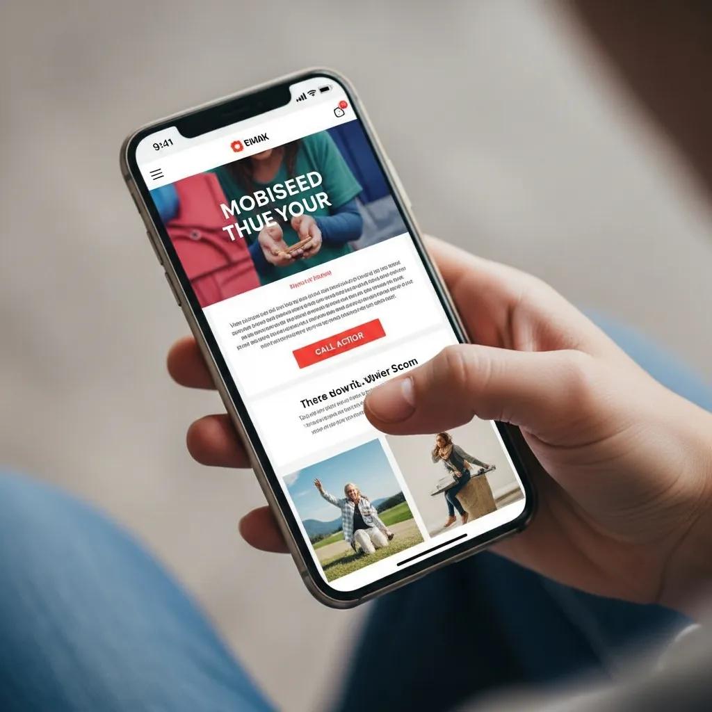
Mobile-first design means designing for phone screens first, then scaling up for larger displays. It removes common usability barriers that make readers abandon emails. Mobile-focused emails use single-column layouts, slightly larger type, and touch-friendly buttons so people can read and act without zooming — a pattern that typically lifts CTR and conversions. Test across major mobile email clients, since rendering differences affect spacing and tappable areas; testing also reveals where responsive CSS needs client-specific tweaks. Mobile-aware subject lines and preheaders that fit preview panes also help open rates. A smooth mobile experience shortens the path from click to conversion, which matters a lot for local service businesses seeking quote requests or bookings.
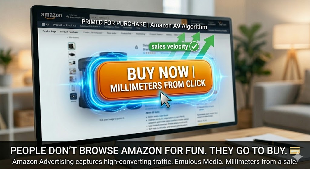
What Are the Best Practices for Crafting High-Converting Calls to Action?
A high-converting CTA is a simple, benefit-forward command that tells the reader what to do next, is easy to tap, and sits clearly in the visual hierarchy. Use action copy that spells out the benefit (for example, “Get a Free Quote”), pair it with high contrast, ample padding, and a touch target that meets mobile minimums. Limit competing links and keep one primary CTA above the fold; add secondary links only for lower-intent readers to avoid decision fatigue. A/B test copy, color, and placement to find what moves the needle for CTR and downstream leads. Track CTA clicks in your analytics so design changes tie directly to KPIs and guide future priorities.
- The next section shows how consistent brand elements reinforce trust and make CTAs more effective.
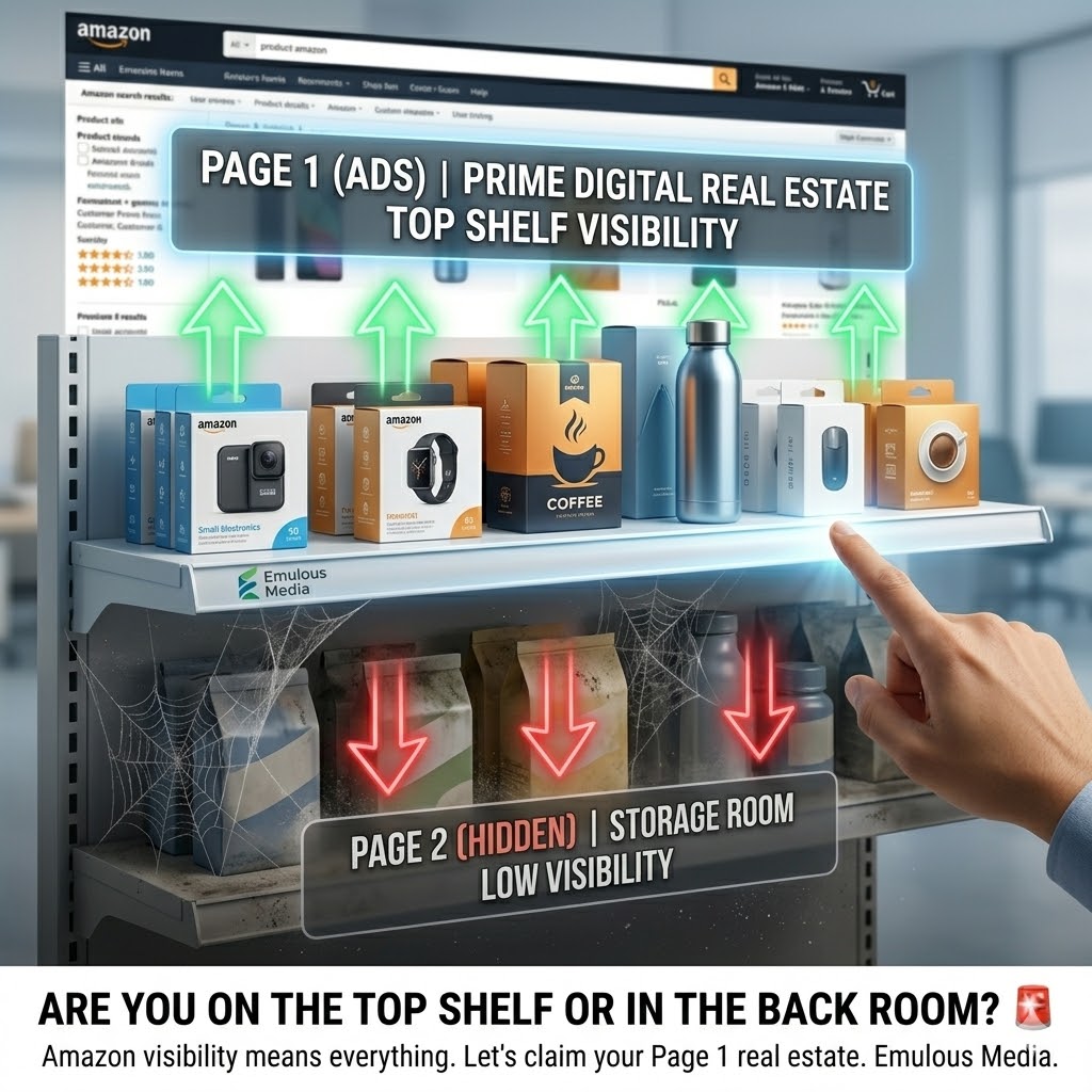
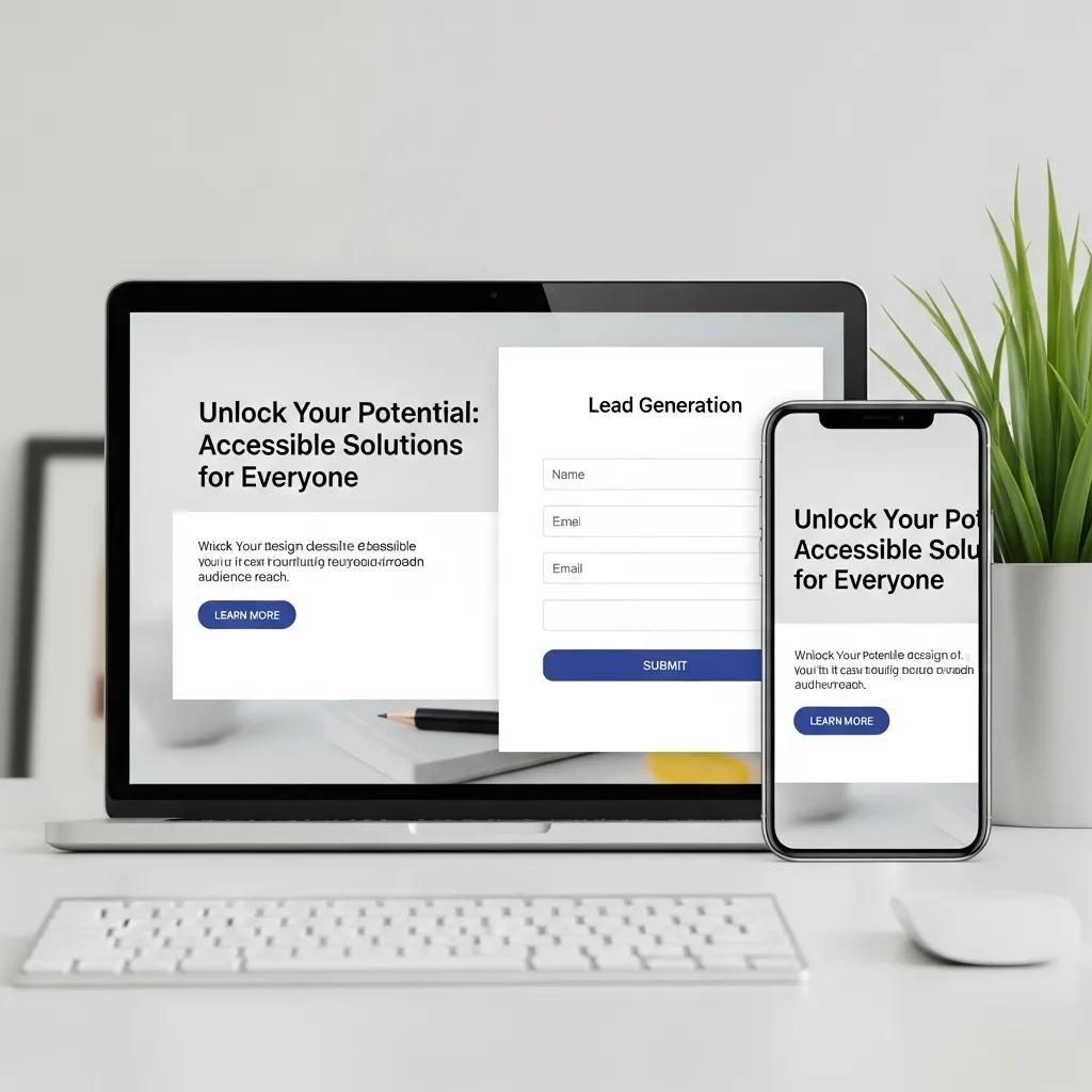
How Can Small Businesses Use Branding and Visual Consistency in Email Templates?

Consistent branding makes emails recognizable and lowers the friction readers face when deciding to click. Use your logo, color palette, and type consistently across headers, hero areas, and CTAs so the email feels like a natural extension of your website and offline materials. Build templates from modular blocks — hero, benefits, social proof, CTA, footer — so campaigns scale without breaking brand rules. Templates should rely on responsive components and a lightweight style system so local teams can populate content quickly without altering layout. When email branding matches landing pages, that continuity reduces bounce and supports dependable lead generation.
Here’s a short checklist to keep templates brand-safe and consistent.
- Include a clear logo in the header: place it where readers expect and use it to reinforce recognition.
- Use a limited color palette: reserve primary colors for CTAs and accents; use secondary colors sparingly.
- Standardize typography: pick 1–2 web-safe fonts and set readable sizes for mobile and desktop.
- Employ modular blocks: assemble templates from reusable sections to speed production and keep consistency.
Consistent branding creates predictable patterns that help recipients scan and act. The following section outlines practical rules for logo placement and color contrast to build that trust.
Why Is Consistent Use of Logos, Colors, and Typography Essential?
Consistent logos, colors, and type signal credibility and help recipients recognize messages from your brand, which reduces hesitation to engage. Repeated visual cues build familiarity so future emails get opened more often. Keep contrast ratios high enough for text and CTA buttons to ensure readability and accessibility, and place the logo in a predictable spot near the header so readers orient themselves immediately. Publish an email style guide with hex values, font rules, and logo usage so everyone follows the same standards. Those controls also make it easier to mirror hero imagery and CTA language on landing pages, creating a coherent journey that improves conversion.
How Does Email Design Align with Website Branding for Better Recognition?
Aligning email design with your website creates a seamless experience from inbox to landing page, which builds trust and cuts bounce. Match headline tone, offer language, and hero visuals so users who click see the same promise confirmed on the page. Use the same CTA wording and color treatment on landing pages to minimize cognitive load and make the next step obvious. Ensure landing pages are mobile-friendly and measure their conversion separately so you can link email design changes to quote requests or form submissions. When email and web branding work together, both channels support predictable lead generation.
What Technical Considerations Ensure Flawless Email Delivery and Accessibility?
Technical details — image handling, sender authentication, and accessibility practices — directly affect deliverability and how emails appear to recipients. Deliverability rests on sender reputation and correct authentication records; while the exact setup varies by platform, knowing DKIM, SPF, and DMARC helps teams avoid common inbox-placement issues. Handle images by choosing appropriate formats, compressing them, and providing descriptive alt text to speed load times and help screen reader users. Account for dark mode and use semantic HTML (proper headings and accessible markup) so emails remain readable across devices. Test across popular clients and run pre-send checks to reduce surprises and protect campaign performance.
The table below compares recommended image formats, sizes, and alt text guidance for home renovation assets.
| Image | Format | Recommended max size / Alt text guidance |
|---|---|---|
| Hero photo (before/after) | Optimized WebP or progressive JPEG | 120–200 KB max; alt text describes the scene and result (e.g., “Kitchen before remodel with dated cabinetry”) |
| Thumbnail gallery | WebP or compressed PNG | 40–80 KB; alt text names the project element (e.g., “New quartz countertop close-up”) |
| Decorative iconography | SVG where supported |
This comparison helps teams balance image quality and speed; picking the right formats reduces load time and improves engagement on slower connections. Next, we cover practical image techniques and responsive delivery.
How Should Images Be Optimized for Speed and Accessibility?
Start by choosing modern formats like WebP when supported or optimized progressive JPEGs, and compress to target sizes that balance quality with performance. Produce multiple widths and serve responsive srcset variants so devices request appropriately sized images and avoid wasted bytes on mobile. Write contextual alt text that explains the image’s purpose for screen readers — for renovation photos, highlight outcomes and materials so non-visual users understand the value. Don’t embed critical text inside images; keep text live in HTML so it scales, remains searchable, and adapts to dark mode. Finally, test images across clients to confirm they display and scale correctly and degrade gracefully when blocked.
How Do You Design Emails for Dark Mode and Inclusive Accessibility?
Designing for dark mode means choosing adaptable color combinations and, where needed, conditional CSS so logos, text, and CTAs stay legible when a client applies dark rendering. Use higher-contrast pairs and keep high-contrast versions of key assets available for both light and dark themes. Apply semantic HTML structure — logical heading order, clear alt text, and ARIA attributes where appropriate — to support screen readers and other assistive tech. Confirm color contrast against WCAG standards for text and interactive elements, and test with real screen readers to verify reading order and link labels. These accessibility steps broaden your audience, cut legal and reputation risk, and often improve conversion metrics.
How Do Subject Lines, Preheaders, and Personalization Enhance Email Effectiveness?
Subject lines, preheaders, and personalization work together to boost open rates and relevance by setting expectations and highlighting value in the inbox preview. A concise subject line states the core benefit or reason to open, and a complementary preheader expands on that message instead of repeating it. Personalization — used thoughtfully — increases relevance by referencing local context, recent interactions, or project type, which raises open and click propensity. Dynamic content and segmentation make sure subscribers see material that matters to them, reducing unsubscribes and improving conversion. Track open rates and segmented CTRs to learn which subject line patterns and personalization tokens actually drive the best behaviors over time.
Here are tested subject line + preheader formulas for service-focused businesses in home renovation.
- “Offer + Benefit”: “Save on Kitchen Remodels — Free Design Consult”
- “Question + Curiosity”: “Thinking about new countertops? See your options”
- “Localization + Urgency”: “Local trim repair slots open this month — Book now”
These templates prioritize clarity and preview-pane fit to maximize opens. The next section covers micro-copy tactics and token use to personalize without tripping spam filters.
What Are the Best Practices for Writing Engaging Subject Lines and Preheaders?
Keep subject lines short, benefit-driven, and aligned with what the recipient expects — aim to fit typical mobile preview lengths so the core message shows. Use the preheader to add detail (offer, timing, or reason to click) rather than repeating the subject line. Use personalization tokens (first name, project type, service area) sparingly and always provide fallback text to avoid awkward or broken messages. A/B test subject-line length, emoji use, and different value propositions to discover what raises open rates for each audience. Measure subject-line performance against downstream conversions so you prioritize messages that not only open but also drive quote requests or bookings.
How Can Personalization and Dynamic Content Increase Engagement?
Personalization and dynamic content improve engagement by delivering messages tailored to a recipient’s last interaction, project interest, or location, which cuts irrelevant content and boosts action. Segment lists by project stage — lead, estimate, active project, post-project — and surface CTAs or imagery that match each group, such as “Schedule Final Walkthrough” for active clients or “Get an Estimate” for new leads. Use dynamic blocks to show nearby project photos or seasonal offers relevant to the reader’s area to increase perceived relevance. Always measure segment-level open, CTR, and conversion rates to confirm personalization produces measurable uplift and respects privacy preferences. Clear segmentation rules and test plans keep personalization scalable and maintainable.
How Can Small Businesses Implement Email Design Best Practices for Measurable Results?
Putting these practices into action requires a simple workflow — design, build, test, deploy, measure — that links specific design changes to KPIs like open rate, CTR, and lead conversion. Start with an audit to find layout and accessibility gaps, then prioritize fixes that remove friction (for example, a mobile redesign or CTA simplification). Run controlled A/B tests to validate which changes deliver statistically meaningful improvements, and track downstream metrics like quote requests and booked appointments. The table below maps common design changes to likely metric impacts to help prioritize work and set realistic goals.
| Design Change | Metric Impact | Typical % Improvement (illustrative) |
|---|---|---|
| Mobile-first single-column layout | Click-through rate | +10–25% |
| CTA simplification (one clear CTA) | Conversion on landing page | +8–20% |
| Image optimization (smaller, responsive images) | Load time and CTR | +5–15% |
Use this KPI mapping to connect specific design work to measurable outcomes and set sprint targets. The next section shares brief case-style examples of targeted design changes that produced measurable lifts in home renovation scenarios.
What Are Real-World Examples of Successful Email Designs in Home Renovation?
Here are anonymized examples that illustrate practical gains. One remodeler moved from a multi-column, desktop-first template to a mobile-first single-column layout and consolidated several equal-weight CTAs into one primary “Request a Quote” button; after two A/B tests the campaign showed an illustrative 18% rise in CTR and a 12% lift in quote requests. Another contractor switched hero images to WebP and improved alt text, reducing image load failures and producing a 9% engagement boost among subscribers on slower connections. A third example used segmentation by project type and dynamic imagery for kitchens versus bathrooms, which increased relevance and drove more form completions for targeted segments. These examples show how design and personalization changes translate into measurable business outcomes.
How Does Emulous Media Empower Teams to Manage Email Marketing Internally?
Emulous Media Inc. focuses on helping small businesses run effective email marketing in-house by teaching teams to design, test, and measure campaigns themselves. The enablement roadmap centers on reusable templates, responsive patterns, accessibility checks, A/B testing frameworks, and KPI dashboards so teams can cut agency dependency while keeping measurable results. The program emphasizes practical, trackable outcomes — more lead generation and predictable growth — by giving internal staff template libraries and analytics practices that link design changes to conversions. For companies that want guided implementation, the program maps an audit through a pathway to self-sufficient campaign execution while keeping control and learning inside the client team.
What Steps Should You Take to Start Improving Your Email Marketing Design Today?
Start with a short, prioritized action list you can execute in sequence to get measurable gains quickly. Begin with an audit, build one mobile-first template, implement a single clear CTA, and run simple A/B tests to measure impact — this approach reduces complexity and delivers early wins. Use cross-client testing tools and analytics to validate changes before full rollout, and schedule regular reviews to iterate based on performance. The checklist below is a HowTo plan for small teams to organize work and track results.
- Conduct an email audit: review templates, load times, and accessibility gaps.
- Build a mobile-first template: single-column layout, readable fonts, and one primary CTA.
- Implement A/B tests: test subject lines, CTA copy, and layout changes with defined KPIs.
- Optimize assets: compress images, add descriptive alt text, and create responsive variants.
- Align landing pages: match CTA language and visuals to reduce post-click friction.
- Review and iterate: analyze results and prioritize the next changes based on KPI impact.
These steps create a clear path from assessment to measurable improvement and are designed for small internal teams to execute. The final section explains how to book a focused strategy session to speed implementation with expert guidance.
How Do You Book a Strategy Session with Emulous Media Inc.?
To get the most from a strategy session with Emulous Media Inc., bring a short audit packet with recent email examples, current KPIs (open rate, CTR, conversion), and your top lead-generation goals so the conversation is action-focused. Expect an audit overview, prioritized fixes, and a suggested timeline for measurable changes tied to your KPIs — the aim is to leave with a short, executable action plan. Contact Emulous Media Inc. via the company website or the listed business profile and request a strategy session with the team lead; ask about a six-week enablement track if you want guided support. Bringing sample emails and clear conversion goals makes the session more productive and helps the team recommend targeted, measurable next steps.
Where Can You Learn More About Emulous Media’s Email Marketing Services?
For full details on services that support internal enablement and lead generation, visit Emulous Media Inc.’s official site or their public business profile to review offerings for training, template libraries, and analytics enablement. The company targets small businesses that want to run marketing internally — especially in home renovation and remodeling — and prioritizes measurable results and independence from agencies. To prepare for a conversation, gather recent campaign reports, conversion goals, and example subscriber segments so you can focus the discussion on tactical enablement and KPI mapping. Booking a short strategy session is the fastest way to turn best-practice guidance into a prioritized plan with concrete metrics to track.
Frequently Asked Questions
1. What are the key elements of email accessibility?
Email accessibility means making messages easy to read and interact with for everyone, including people who use assistive technologies. Key items include semantic HTML for clear structure, meaningful alt text for images, sufficient color contrast for text and backgrounds, and legible fonts. Where helpful, ARIA attributes can improve screen reader interactions. Prioritizing accessibility widens your audience, helps meet legal standards, and often improves engagement and conversion rates.
2. How can A/B testing improve email marketing results?
A/B testing (split testing) lets you compare two versions of an email to see which performs better on metrics like open rate, CTR, and conversions. By testing subject lines, CTAs, layouts, or imagery, you collect data that informs future campaigns. This iterative approach sharpens your strategy over time, leading to higher engagement and better ROI. Regular testing fosters continuous improvement and stronger results.
3. What role does mobile optimization play in email marketing?
Mobile optimization is essential because many people read email on phones. A mobile-optimized email uses responsive design, single-column layouts, and larger touch targets for CTAs to ensure a smooth experience. Reducing friction makes it easier for recipients to read and act. As mobile use grows, prioritizing mobile-friendly design translates to higher opens, better CTRs, and more conversions.
4. How can small businesses measure the success of their email campaigns?
Small businesses measure email success with KPIs like open rate, click-through rate, conversion rate, and unsubscribe rate. Analytics tools provide insight into user behavior and what content resonates. Set clear goals for each campaign (for example, more leads or bookings) to evaluate performance. Regularly review results and iterate to improve future campaigns.
5. What are some common pitfalls to avoid in email design?
Common design mistakes include overcomplicated layouts, ignoring mobile users, and skipping cross-client testing. Complex designs can distract readers; lack of mobile optimization leads to poor experiences on phones; and insufficient testing can produce rendering issues or broken links. To avoid these, keep layouts simple, ensure responsiveness, and test thoroughly before sending.
6. How can personalization enhance email marketing effectiveness?
Personalization boosts effectiveness by tailoring content to recipients based on preferences, behavior, or location. This can mean using a name, referencing a recent interaction, or suggesting relevant services. Personalized emails tend to see higher opens and clicks because they feel more relevant. Use segmentation and data thoughtfully to create targeted campaigns that drive conversions and loyalty.
7. What are the benefits of using modular email templates?
Modular templates deliver consistency, speed, and scale. Predefined blocks let teams keep a cohesive brand while producing campaigns faster. They make updates easier and let marketers swap sections to A/B test content quickly. Modular designs support efficient workflows and more effective, repeatable email programs.
**