You’re getting traffic. Your ads are running. People are landing on the site. Then almost nothing happens.
That’s the moment most business owners start blaming the wrong thing. They blame Google Ads, SEO, social media, the market, the season, or the audience. Sometimes the problem is traffic quality. More often, the website is leaking value at the exact point where a visitor should feel clarity, trust, and momentum.
How to improve website conversion rates isn’t really a question about buttons or colors. It’s a question about friction. What’s stopping a ready buyer from taking the next step? On some sites it’s speed. On others it’s weak messaging, a clunky mobile layout, or a form that asks for too much too soon. For local service companies, it’s often a trust problem disguised as a design problem.
The businesses that grow steadily don’t treat conversion rate optimization like a bag of tricks. They treat it like a system. Diagnose the leak. Prioritize the fix. Test the change. Scale what works. That’s the playbook.
If you want a shorter companion list before you go deeper, Cometly’s guide on 5 easy ways to improve your conversion rate is a solid primer. The deeper work starts when you stop guessing and start reading your website like a sales process.
Table of Contents
- Why Your Website Traffic Is Not Turning into Sales
- Diagnose Your Leaks Finding Where Visitors Drop Off
- Prioritizing For Impact Your First CRO Experiments
- Advanced Plays Optimizing Speed Mobile and Checkout
- The Local Conversion Engine For Service Businesses
- Scaling Your Wins With Testing and AI Automation
Why Your Website Traffic Is Not Turning into Sales
A business owner in Orlando or Charlotte launches a new campaign, sees traffic climb, and expects sales to follow. The calls stay flat. The cart stays quiet. The problem usually is not traffic volume. The site is failing at one of the jobs that creates revenue.
In practice, three breakdowns show up again and again. Visitors do not understand the offer fast enough. The path to action asks for too much work. Or the page has not earned enough trust to justify the next step. For an e-commerce brand, that can mean weak product messaging, poor mobile usability, or checkout hesitation. For a local service company, it often shows up as vague service pages, weak proof, or a quote form that feels like homework.
This is why conversion work starts with diagnosis, not random page edits. Before changing colors, swapping headlines, or buying more clicks, get clear on what the site is supposed to do at each step. A homepage should orient. A service page should build intent. A product page should answer objections. A form or checkout should make the next action feel easy and low risk.
Use more operational questions:
- Is the value clear within a few seconds? A first-time visitor should understand what you sell, who it is for, and why your option makes sense.
- Is there one obvious next step? Pages lose sales when they split attention between too many buttons, offers, and navigation choices.
- Does the page reduce risk? Reviews, guarantees, process details, pricing context, before-and-after examples, and local proof all help people move.
- Does the traffic match the page? Paid search traffic in Charlotte looking for emergency HVAC repair needs a different landing experience than a shopper comparing patio furniture in Orlando.
A website works like a storefront with sales staff, signage, and a checkout counter rolled into one. If any part creates confusion, friction, or doubt, revenue drops before your team ever gets a chance to sell.
I have seen this pattern for two decades. Owners often judge a website by whether it looks modern. Buyers judge it by whether it answers their question and makes the next step feel safe.
That is why even small conversion improvements matter. Better conversion rates make every channel perform better. Paid media gets more efficient. SEO traffic produces more value. Email and direct traffic generate more revenue from the same visitor count. If you need a cleaner way to measure that impact, this guide to tracking marketing metrics and KPIs covers the numbers that connect traffic to sales.
The upside is real, especially once a business stops guessing and starts running a CRO playbook. Diagnose the leak. Prioritize the fixes with the highest revenue impact. Test changes before rolling them out across the site. Then scale what wins with automation and AI. If you want a practical outside view of what usually improves results first, Cometly’s guide on 5 easy ways to improve your conversion rate is a solid reference point.
For local service businesses, that discipline keeps ad budgets from getting wasted on pages that never build trust. For e-commerce teams, it prevents expensive traffic from dying on product, cart, or checkout pages. In both cases, the goal is the same. Turn more of the attention you already paid for into booked jobs, completed checkouts, and qualified leads.
Diagnose Your Leaks Finding Where Visitors Drop Off
Before changing headlines, redesigning pages, or rewriting forms, find the leak.
Most websites behave like a bucket with holes in different places. One page leaks attention. Another leaks trust. A checkout page leaks patience. If you keep pouring traffic into the bucket without finding the hole, you just pay more to lose more.

Start with the numbers
The first layer is quantitative. You need to know where people enter, where they move, and where they quit.
A properly configured Google Analytics setup gives you that baseline. Look at landing pages, traffic sources, device categories, key events, and path reports. Then inspect the pages closest to revenue: service pages, quote forms, product pages, cart, checkout, and contact pages.
The five-step CRO process is Measure, Analyze, Hypothesize, Test, Implement, and Inspectlet notes that combining quantitative data with qualitative evidence is what reveals why users drop off. Their guide explains that this analysis phase matters because raw metrics alone won’t explain issues like confusion on form fields or frustration on slow pages, and it specifically points to combining analytics with heatmaps and session replays in their CRO framework.
Use your analytics review to answer practical questions:
- Which page gets traffic but not action
- Which traffic source drives visits but weak conversion intent
- Where does mobile underperform desktop
- Which form or checkout step loses people most often
If you need a stronger measurement foundation before testing, this guide to tracking marketing metrics and KPIs helps clarify what should be measured.
Then watch behavior
Numbers tell you where the problem is. Session recordings, heatmaps, and form analytics tell you why.
Tools like Hotjar or FullStory are useful. You can watch real visitor behavior instead of debating assumptions in a meeting. You’ll often find the same patterns repeating:
- Repeated clicks on non-clickable elements: The page is signaling interactivity where none exists.
- Rapid back-and-forth scrolling: The visitor is hunting for missing information.
- Form hesitation: A field asks for something too early, too personal, or too confusing.
- Dead zones on mobile: Important content or buttons are buried, crowded, or hard to tap.
Practical rule: Don’t redesign the whole site because one page underperforms. Fix the leak closest to the sale first.
What a useful diagnosis looks like
A good diagnosis is specific. Not “the homepage needs work.” More like this:
| Problem area | What you see | What it usually means |
|---|---|---|
| Service page | High visits, low form starts | Weak offer or low trust |
| Product page | Add-to-cart clicks stall | Pricing, shipping, or detail gap |
| Checkout | Abandonment spikes | Friction, too many steps, poor mobile UX |
| Contact form | Starts but few completions | Form asks for too much |
That level of clarity changes everything. Now you’re not guessing. You’re running a repair process.
Prioritizing For Impact Your First CRO Experiments
After you identify the leak, the next job is choosing the first fix that can change revenue, not just the page layout.
It is common for businesses to lose months. They approve a redesign, rewrite everything, swap platforms, and still cannot point to the one change that improved conversion. Good CRO work is closer to triage. Fix the issue that blocks the sale closest to the money.
Use an impact versus effort filter
I use a simple rule with clients in Orlando and Charlotte. If a test can change buyer understanding, trust, or momentum without requiring a developer for two weeks, it goes near the top of the list.
That matters because early wins create two things every CRO program needs. More conversions, and proof that the process works.
| Change type | Effort | Likely impact | Priority |
|---|---|---|---|
| Clearer headline | Low | High | Start here |
| Better CTA text and placement | Low | High | Start here |
| Simplified navigation | Low to medium | High | Early |
| Added trust signals | Low | Medium to high | Early |
| Rebuilt page structure | Medium to high | High | After quick wins |
| Full site redesign | High | Unclear without testing | Later |
A local roofing company and an e-commerce brand should both use that filter, but the test choices will differ. A service business usually gets faster gains from better offer framing, stronger proof, and shorter forms. An online store often gets faster gains from product page clarity, shipping visibility, and add-to-cart flow improvements.
What usually deserves the first test
The first round should focus on four areas: message, action, trust, and friction. Those are the parts that decide whether a visitor moves forward or stalls.
Headline clarity
The hero section needs to answer basic buying questions fast. What do you offer? Who is it for? Why should someone choose you now?
Clever copy often loses to plain language because buyers are scanning, not studying. If a Charlotte HVAC company says "Home Comfort Reimagined," that sounds polished but vague. "AC Repair and Installation in Charlotte with Same-Day Availability" gives the visitor something concrete to act on.
CTA improvement
Button copy should match buying intent. "Learn More" rarely helps because it asks for attention without offering a payoff. "Request an Estimate," "Book a Service Call," and "See Available Packages" set clearer expectations.
Small CTA tests can produce outsized gains, as noted earlier in the article's CRO research. The reason is simple. Visitors decide in seconds whether a click feels useful or risky.
Navigation cleanup
Pages built to convert need fewer exits. If the page goal is booking an appointment or starting checkout, the layout should support that goal instead of competing with it.
I often see local service sites send paid traffic to pages with full top navigation, sidebar links, and three unrelated offers. That setup asks the visitor to browse. It does not ask them to decide.
Trust placement
Trust works best at the point of doubt. Put reviews near the form. Put financing details near pricing. Put guarantees near the CTA.
For e-commerce, that may mean returns, delivery timing, and payment security beside the add-to-cart button. For Orlando service businesses, it may mean license information, local reviews, and before-and-after proof near the estimate request. On focused high-converting landing pages, this placement often matters more than adding more copy.
Prioritize with a simple playbook
Use a sequence like this:
- Diagnose: Confirm the page and step where buyers hesitate.
- Prioritize: Pick changes that are easy to launch and close to the conversion event.
- Test: Change one meaningful variable at a time so the result is usable.
- Scale: Roll proven winners across similar pages, campaigns, or locations.
That framework keeps teams from chasing random ideas. It also makes AI more useful later, because AI performs best when it is working from patterns you have already validated, not guesses you have never tested.
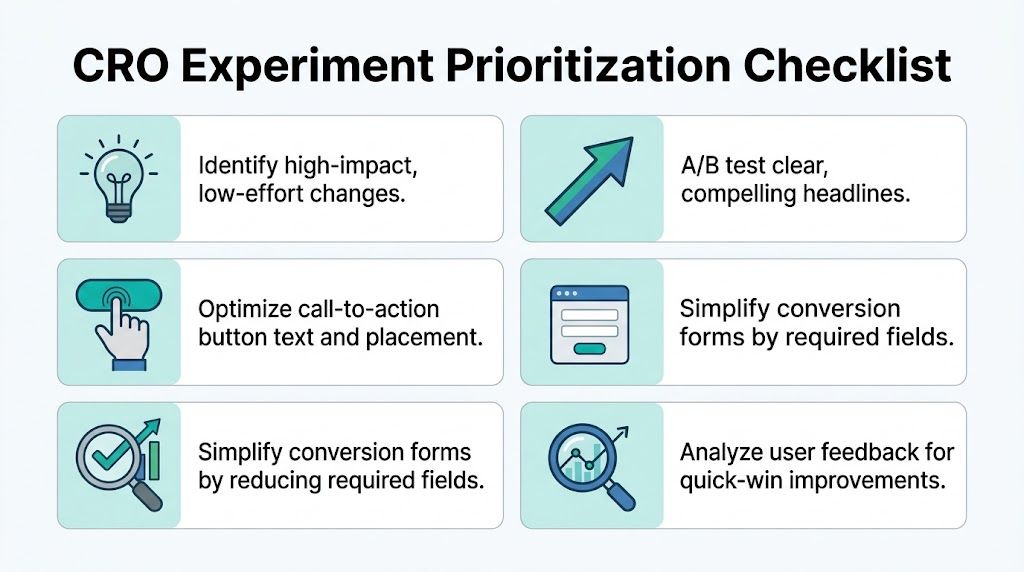
A practical shortlist for your first experiments
Start here before approving a full rebuild:
- Rewrite the hero section: Lead with a specific offer or outcome.
- Tighten the primary CTA: Make the next step clear and low risk.
- Move proof next to hesitation points: Put testimonials, guarantees, and credentials where buyers pause.
- Cut form fields: Ask only for information the sales team will use.
- Remove distractions: Keep one main action per page.
- Test market-specific copy: Orlando and Charlotte buyers often respond to different concerns, timelines, and service expectations.
One more caution. Prioritization is not about picking the easiest task on the list. It is about picking the test most likely to change buyer behavior.
The goal is a page that makes the next decision obvious. That is how you get cleaner test results, faster wins, and a CRO program you can scale.
Advanced Plays Optimizing Speed Mobile and Checkout
Quick wins help. Technical performance separates average sites from serious revenue machines.
In this scenario, many businesses hit a ceiling. The copy improves, the CTA gets sharper, but the site still loads slowly, frustrates mobile users, or makes checkout feel like paperwork. That’s when conversion rate gains flatten out.
Speed is a conversion tool
Speed isn’t a technical vanity metric. It’s buyer psychology.
Blue Cactus reports that pages loading in 2.4 seconds achieve a 1.9% conversion rate, while pages taking over 5.7 seconds convert at less than 0.6%. The same source notes that mobile traffic makes up over 53% of global visits, which is why slow pages hurt twice: first in user patience, then in lost conversions, as detailed in their guide on improving website conversion rates.
When a page is slow, people don’t think, “This server response is inefficient.” They think, “This company feels disorganized.”
The most common speed fixes are usually familiar:
- Compress images: Oversized hero images are frequent offenders.
- Reduce render-blocking scripts: Too many plugins and third-party tools slow first interaction.
- Use better hosting and caching: Weak hosting drags everything down.
- Audit templates on mobile: A desktop-friendly page can still choke on a phone.
If speed is a known issue, start with a structured website speed optimization process instead of random plugin stacking.
Mobile design has to remove effort
A desktop site that shrinks onto a phone isn’t mobile optimization. It’s a smaller problem.
Mobile users are usually less patient and more task-driven. They want quick proof, quick access, and fast action. That means:
- Keep headings short
- Use thumb-friendly buttons
- Make phone numbers tap-to-call
- Place key trust signals above the fold
- Avoid walls of text before the action
A mobile visitor won’t fight through clutter to reward your business with a lead.
Slow mobile pages and cramped layouts don’t just reduce usability. They quietly train visitors to leave.
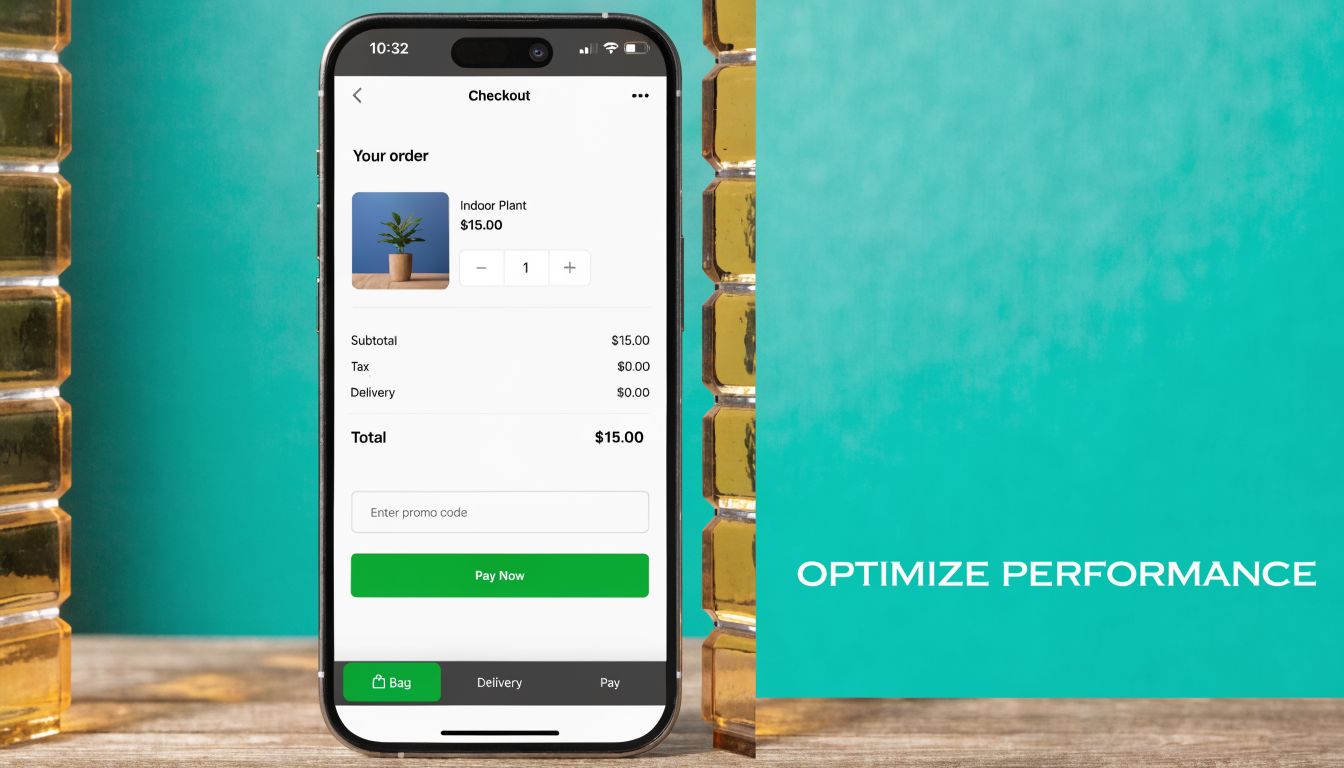
Checkout and forms should feel easy
This applies to ecommerce and lead generation alike. The last step should feel lighter than the first, not heavier.
Convertica reports that reducing form fields from 11 to 3 can push conversions to 25%, and that live chat can increase conversions by 40% while videos on landing pages can boost rates by up to 80%, according to their roundup of conversion rate optimization statistics. The lesson is simple. Friction compounds near the finish line.
A few practical rules help:
| Area | What hurts conversions | What usually works better |
|---|---|---|
| Checkout | Forced account creation | Guest checkout or simpler path |
| Lead form | Too many required fields | Ask only what sales needs now |
| Mobile form | Tiny fields and long dropdowns | Large inputs and fewer steps |
| Support gap | No way to ask questions | Live chat or clear contact option |
If the page asks for commitment before trust is earned, users hesitate. If the page keeps the next step easy, they move.
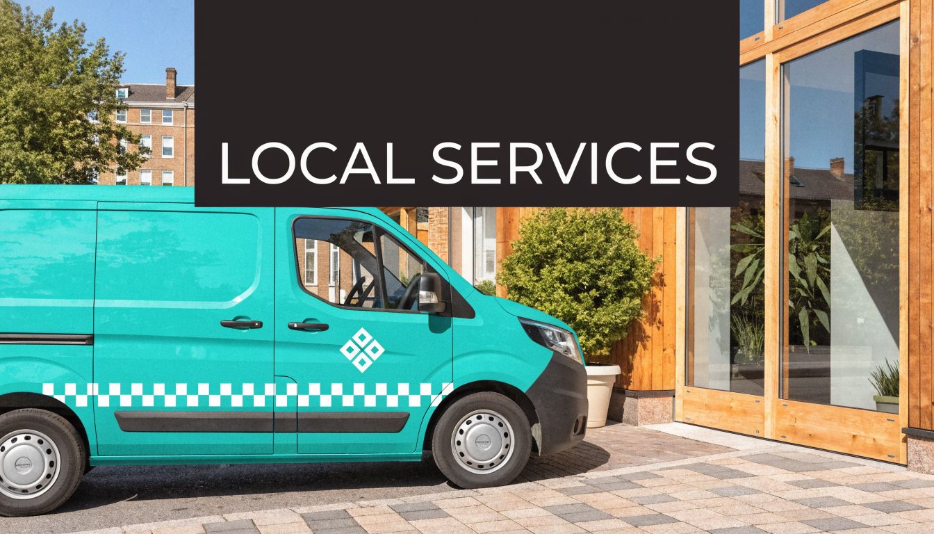
The Local Conversion Engine For Service Businesses
Most CRO advice is written as if every business is an online store. That’s a mistake.
A home service company in Orlando, a law firm near Lake Mary, or a clinic expanding toward Charlotte doesn’t win conversions the same way an ecommerce brand does. Local service buyers are looking for competence, proximity, responsiveness, and proof that you serve their area well.
Local intent changes the conversion strategy
Craft + Root notes that for service businesses, over 70% of conversions can stem from local “near me” queries. The same source adds that geo-targeted strategies such as using a local CDN for Florida and Charlotte markets can boost conversions by 35%, and AI-personalized local testimonials can create 2.5x more trust than generic social proof in their article on improving website conversion rates.
That changes how you build pages.
A local visitor doesn’t just want to know what you do. They want signs that you do it nearby, that you understand their market, and that contacting you will lead to a real response.
What local service pages need
The strongest local conversion pages tend to share the same ingredients:
- Area-specific messaging: Mention the city, service area, or neighborhood naturally.
- Clickable phone numbers on mobile: Don’t make a ready buyer copy and paste.
- Local proof: Reviews, testimonials, and examples that sound like they came from real nearby customers.
- Credentials that reduce risk: Licenses, associations, certifications, and years of experience.
- Fast access to action: Quote request, consultation booking, or call button without hunting.
For businesses leaning into lead generation channels, Local Services Ads strategies become more effective when the landing page matches the local intent behind the click.
Here’s a useful example of how local visibility and conversion strategy overlap:
Trust has to feel local, not generic
A generic testimonial saying “great service” doesn’t carry much weight. A testimonial tied to a local problem, location, or service outcome does.
This is also where AI can help. Instead of showing the same static proof to every visitor, businesses can tailor testimonial blocks, location references, and service language based on the market and campaign source. One option in that broader stack is Emulous Media Inc, which works across website design, paid traffic, local SEO, and AI automation to align traffic acquisition with on-page conversion behavior.
A local landing page should feel like it was built for that market, not copied into it.
That difference matters more than most service companies realize.
Scaling Your Wins With Testing and AI Automation
Once you find changes that improve performance, the next job is turning those wins into a repeatable system.
That’s where testing matters. A/B testing is simply controlled decision-making. Instead of arguing over which headline, form layout, or CTA is better, you put both versions in front of real visitors and let behavior decide.
Testing settles debates
Inspectlet’s CRO process frames this well with Measure, Analyze, Hypothesize, Test, Implement in their earlier guide. That sequence matters because random changes produce random learning. Good testing starts with one clear hypothesis and one important variable.
A few examples:
- Headline test: Clarity versus cleverness
- CTA test: “Request a Quote” versus “Get My Estimate”
- Form test: Short form versus longer qualification form
- Trust test: Testimonials near the CTA versus lower on the page
The result isn’t just a lift on one page. It’s better judgment across the whole funnel.
AI helps you scale relevance
AI becomes valuable when you stop using it as a gimmick and start using it as an operating layer.
It can help segment visitors by behavior, traffic source, and intent. It can personalize on-page messaging, support faster analysis of user patterns, and trigger smarter follow-up workflows after a lead converts or abandons. That’s especially useful when direct traffic converts at 3.3% to 3.5%, paid search at 3.2%, and organic search at 2.7%, because attribution changes what you optimize first, as noted in Convertica’s CRO statistics earlier in the article.
Live chat can increase conversions by 40%, and landing page videos can boost rates by up to 80%, based on that same earlier source. Those tools work even better when you know which audience should see them and when.
If you’re exploring that layer, AI-driven consumer insights can help connect behavioral patterns to practical actions instead of dumping more dashboards on your team.
The businesses that get the best results from CRO don’t chase hacks. They build a feedback loop. They measure what matters, fix friction, test with discipline, and use automation to scale what works.
If your website gets traffic but doesn’t produce enough calls, forms, or sales, it’s time to treat conversion like a system instead of a guessing game. Emulous Media Inc helps Central Florida businesses and growing brands across the U.S. improve website performance through strategy, design, analytics, paid media alignment, and AI-powered optimization. If you want a clear plan for how to improve website conversion rates on your site, book a free consultation, call 689-255-6327, or visit the contact page to start the conversation.